Introducing StoryPorts Full-Width Emails and Templates
Introducing Full-Width Emails and Templates
Around 1999, driven by low-resolution screens and early versions of Outlook, Hotmail, AOL, and Yahoo, the conventional wisdom among email marketing pundits was that emails shouldn’t be much wider than 600 pixels. Since then, 600-pixel wide emails have been the standard. Occasionally over the past 18 years, some progressive email designers have stretched their designs to 750 or even 900 pixels, but not often.
In contrast, web and app designers have embraced a world of full-width possibility that can stretch and respond to any screen size. Full-width design has been able to facilitate a beautiful, rich, landscaped experience that defines the modern web and more closely resembles how humans actually view the world.
So, why not email? Today, with more CSS standards across email clients, full-width emails are finally starting to come into their own, and email designers are beginning to build emails that look and act a lot more like web pages.
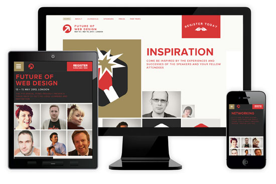
Today, we are excited to unveil StoryPorts’ new full-width email and template feature. It is highly customizable, easy to manage, and fully responsive on any screen size. You can see below how this Business.com email, built in StoryPorts, is both full-width and fully responsive to scale for tablet and mobile screens. Hard to believe that’s an email and not a landing page right?
See email preview here: https://contentctrl.storyports.com/preview/?type=email&eid=14559&simulate=true&uid=1492

Sound interesting? Check out this tutorial on how full-width emails and templates are built in StoryPorts.
Recent Comments